I really like Rebeca Adams picture of the trees. You can really see the texture in the entire photo. I like how the objects on and around the trees have a specific texture as well. I like how the trees aren't right next to each other, but in different areas of the picture. It seems as though she put a kot of thought into the way people will look at the picture and how it would make them feel.
I really like Taylor Grace's photo because it reminds me of a dress. The plain black background really emphasizes the white of the fabric. Very pretty.
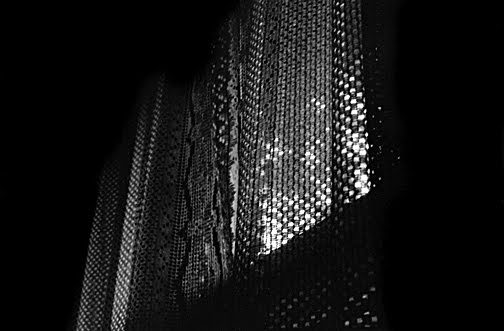
I liked sam baldwin's photo because it looks sparkly and shiny. I think that pictures are better when you can't tell what they are at first because you have to think and use your imagination. The patterns on this photo make it look somewhat familiar because you see circular designs like this alot in many different things. I think she did a good job of making a simple object interesting.
I like how Sierra Strong's photo really captured the texture of what a horses mane and fur would feel like. The contrast of light exposure also makes the picture seem more dramatic and allows certain areas to stand out more than others. - Susie Verra
I like Bailey Kircher's photo of the fence. The texture of the fence is well represented as the camera angle creates depth by showing the skies above the top of the fence. There is something very placid and still about her picuture which creates the mood of the photograph. The photo also creates a sense of mystery because anything could be on the other side of the fence. This photo would be considered a success for this project, good job Bailey!
I really like Kayla Chetneys photo. The picture was unique and special. The picture was shiny and fun. The way that the hot air balloons hung vertically gave the picture length. -Sierra Strong.
i really like the third from the bottom. i dont know whose it is, but i love the contrast of the different textures. i really like how the light is hitting the surfaces. i also like how most of the picture is in focus. it looks really good, and this picture is deffinatley one of my favorties.
I really like Bailey Kircher's photograph. I enjoy how you can see the sky above the fence, it gives the sense of being open. I like how the texture is clearly represented by the fence, it looks very nice. -Brooke McGarr
I really like the third picture from the top, Sam Baldwin's photo. I like how there's light shining on part of the picture, and how the background is black. It looks like the photo just kind of fades back into the picture, and it gives a really good effect to the photo. This picture was definitely one of my favorites.
Im obsessed with alanna swans solid choice of a bench and a leaf for her texture picture. There so much texture i cant even fathom it. Ineffable. Beyond words. I like how it displays the blockyness of the wood and then the delicateness of the leaves. So texture. -sarah reeves
I Like Taylor Grace's photo because it really captures how that type of fabric would feel. The background , foreground and middleground really make the picture alot more beautiful then if it was just a simple piece of fabric. Also the shades, even though its only black and white create a curious feeling.
I like Paul Smiths photo of the track. The photo came out very well exposed. I like it because the angle of the shot makes the line seem endless and kind of guides your eye across the photo. Nice job Paul.
I like Paul Smith's photo because my eye is drawn to the line on the track and then it leads your eye to the other end of the track, kind of like the line is endless. Nice Work!
I like Paul Smith's photo because the line from the track draws your eye down the line, it seems like the line is going on forever, it leads MY eye to the end of the track and then to the rest of the photo..
I really like paul smith's photo. I like the value of it. It is split into thirds which really draws attention to it. He also did a great job with focusing it.
I really like Becca Adams photograph. I like how she used two focal points instead of only one. Throughout this texture project I have seen focal points of only one image, however, she made the focal point of two trees. I thought that was clever. I also like how the back ground is still unfocused, full of trees. On the bigger tree to the right of the photo I can see the shadow of darkness on the left side of the tree. I think that made the photograph even better. Lastly, I don't think she was trying to do this on purpose, but, I think the photograph looks better due to the fact that the two trees for the focal point are two different types of trees. Overall, I think this photograph is great, and I wouldn't change anything about it. -Courtney Jenkins
I really like the fifth picture from the top. The texture of the track is shown perfectly, and it has a short depth of field. I also really ke the position the photo was taken from because it shows the track stretching out. Finally I love the contrast of the white line in the middle to the two areas of darker color on either side. -Megan Shevlin :)
I really enjoy Aaron Newell's photo. I love how he focused on the grass through the inside of the bottle and the background is out of focus. a very well thought out photo.
I loved Kayla's picture! There was so much to look at that you had to focus on it for a while to figure out what it was a picture of. I think it's really unique and I love it!
I really like paul smith's photo. And how the line is in focus and nothing else is. The angle he took the photo at is amazing. I also like the value of it.
i really like becca adams picture beccause it shows great texture in the bark of the tree and it also has a happy feel to the picture with the light from the sun shining on the tree :) ~karleena Beveridge
i really like sam Baldwins photo. It really captures the purpose of the assignment which is texture. It also is good because it leaves me wondering im not sure what it is so its intresting because it makes me curious. She did a very good job focusing this picture, and i really like the lighting, also she did a good job using field of view. -Sage grasso
I like Sierra Strong's photo because I love horses. Also, the angle and way she took the picture at is one i would never thought of. But it turned out very good. The picture is so detailed, where you almost feel like the horse is right in front of you.
i like alannas picture the most because of the shades that do from light to dark. It also shows textue in a way with the spirls in the wood. And it really makes me want to be there where she took the picture
I like the feel of Taylor Grace's photo. It reminds me of princesses, reminding me of when I was 5 and thought I was a princess. Even though I am... :) To me the photo is very nostalgic and the texture and feeling the photo portrays is amazing, I can feel the tulle just by looking at it, very well done :)
Im lovin Alanna Swan Blackburn's texture picture because it shows the texture of the leaves and the wood. I believe it was a very superior choice. I like the contrast between the dark wood and light colored leaves. very solid alanna, very solid. -natalie didio
I really like Bailey Kircher's photograph and how the knots in the fence contrast well with the lightness of the wood. Also, how the fence could symbolize the American suburban.
I really liked Paul Smith's photo because the middle ground is in focus and though the foreground is out of focus you can still fell the texture of the track. I also liked how he shot the line going straight down the center to create a balance in the photo. -Beth Mirahver
I think Sierra Strongs photo really emphasizes texture. It also shows light and dark areas, which show how creative the picture was and also makes it more interesting. Just by looking at the photo I think a person could really imagine how a horse would feel if they were to touch it. I love this picture, and she did a great job showing texture!
I really like Paul Smith's photo of the track's texture. I like how the middle ground of the white line is in focus and the foreground/background are out of focus. The way the picture is taken right in front/on the line makes it look mysterious because it gradually comes to a point. The contrast between the white line and the dark track looks really good also.
I really like Paul Smiths photograph on texture. The spot where the photo was taken gives a look into something that most people don't really focus on. The rough texture of the ground with the off set off white and a beatiful background makes it a wonderful shot and a success.
I really like Baileys photo. I think that the lines in this photo are really strong. The picture is framed nicely. This photo displays the texture of the fence with rough wood. The values and contrast in the fence add interest. The clouds are also a point of interest.
I like Jen Carillos photo of the weights. I like how only the right foreground of the picture is in focus. I also like how there is light coming through behind the weights. This photo makes me feel like im being dragged into it. I also like how your eye moves to the center of the photo. -Rachel Tubbs
I like Sierra Strongs photo of the horse.The exposure is very precise. The picture has a very elegant look to it. It makes me feel like i am standing their looking at the horse. The photograph was nicely done
I really like the 5th photo from the bottom. The way it shows the same thing (dumbbell) as sort of fading and losing focus as it gets smaller, and my eye was particularly drawn to the center of the largest (closest) dumbbell. Great job whoever did took this photo.
I like Bailey Kircher's photo of the fence because it gives what feels like a visual representation of the proverbial fence used in common phrases, like "The grass is always greener on the other side of the fence."
I like Aaron Newell's photo. It shows good texture with the rock, grass and the object in the middle. My favorite part about the photo is the little object that looks as if is magnafying the grass or has grass growing in it, this is also the focal point. I find this picture really interesting and i like it a lot.
I like paul smith's photo a lot due to the symmetry of it. Its great how the horizon line is dead center in the middle of the photo. The contrast of the lines on the track make this an awesome piece of art.
in the photograph of the track i like the angle the photo was taken at and how the shallow depth of field gives a lot of detail to the track. - Nick Robbins
The photograph of the track: I like the line that leads your eye to the end of the track, and how that line is the focal point. I like how it is in the direct center of the photograph and how the clouds get darker in the top corners. -MY


I really like Rebeca Adams picture of the trees. You can really see the texture in the entire photo. I like how the objects on and around the trees have a specific texture as well. I like how the trees aren't right next to each other, but in different areas of the picture. It seems as though she put a kot of thought into the way people will look at the picture and how it would make them feel.
ReplyDeleteI really like Taylor Grace's photo because it reminds me of a dress. The plain black background really emphasizes the white of the fabric. Very pretty.
ReplyDeleteJenn Carillo
I liked sam baldwin's photo because it looks sparkly and shiny. I think that pictures are better when you can't tell what they are at first because you have to think and use your imagination. The patterns on this photo make it look somewhat familiar because you see circular designs like this alot in many different things. I think she did a good job of making a simple object interesting.
ReplyDeleteolivia paolano (is mr.aquino's favorite)
I love Sierra Strongs photo.I think it's very unique and a great photo.Beautiful.
ReplyDelete-Nicole Haddadnia
I like how Sierra Strong's photo really captured the texture of what a horses mane and fur would feel like. The contrast of light exposure also makes the picture seem more dramatic and allows certain areas to stand out more than others.
ReplyDelete- Susie Verra
I like Bailey Kircher's photo of the fence. The texture of the fence is well represented as the camera angle creates depth by showing the skies above the top of the fence. There is something very placid and still about her picuture which creates the mood of the photograph. The photo also creates a sense of mystery because anything could be on the other side of the fence. This photo would be considered a success for this project, good job Bailey!
ReplyDeleteStephanie Willis
I really like Kayla Chetneys photo. The picture was unique and special. The picture was shiny and fun. The way that the hot air balloons hung vertically gave the picture length.
ReplyDelete-Sierra Strong.
i really like the third from the bottom. i dont know whose it is, but i love the contrast of the different textures. i really like how the light is hitting the surfaces. i also like how most of the picture is in focus. it looks really good, and this picture is deffinatley one of my favorties.
ReplyDelete-rebecca adams
I really like Bailey Kircher's photograph. I enjoy how you can see the sky above the fence, it gives the sense of being open. I like how the texture is clearly represented by the fence, it looks very nice.
ReplyDelete-Brooke McGarr
I really like the third picture from the top, Sam Baldwin's photo. I like how there's light shining on part of the picture, and how the background is black. It looks like the photo just kind of fades back into the picture, and it gives a really good effect to the photo. This picture was definitely one of my favorites.
ReplyDelete-Marissa Hughes
Im obsessed with alanna swans solid choice of a bench and a leaf for her texture picture. There so much texture i cant even fathom it. Ineffable. Beyond words. I like how it displays the blockyness of the wood and then the delicateness of the leaves. So texture.
ReplyDelete-sarah reeves
I Like Taylor Grace's photo because it really captures how that type of fabric would feel. The background , foreground and middleground really make the picture alot more beautiful then if it was just a simple piece of fabric. Also the shades, even though its only black and white create a curious feeling.
ReplyDelete-Sarah Vasta
I like Paul Smiths photo of the track. The photo came out very well exposed. I like it because the angle of the shot makes the line seem endless and kind of guides your eye across the photo. Nice job Paul.
ReplyDelete-Cody Conine
This comment has been removed by a blog administrator.
ReplyDeleteThis comment has been removed by a blog administrator.
ReplyDeleteI like Sam Baldwin's photo, because it shows texture with the greatest of passions with a lot of detail and great exposure.
ReplyDelete-Pete Fritz
I like Paul Smith's photo because my eye is drawn to the line on the track and then it leads your eye to the other end of the track, kind of like the line is endless. Nice Work!
ReplyDeleteJohn Lines
I like Paul Smith's photo because the line from the track draws your eye down the line, it seems like the line is going on forever, it leads MY eye to the end of the track and then to the rest of the photo..
ReplyDeleteJohn Lines
I really like paul smith's photo. I like the value of it. It is split into thirds which really draws attention to it. He also did a great job with focusing it.
ReplyDeleteBailey Kircher
I really like Becca Adams photograph. I like how she used two focal points instead of only one. Throughout this texture project I have seen focal points of only one image, however, she made the focal point of two trees. I thought that was clever. I also like how the back ground is still unfocused, full of trees. On the bigger tree to the right of the photo I can see the shadow of darkness on the left side of the tree. I think that made the photograph even better. Lastly, I don't think she was trying to do this on purpose, but, I think the photograph looks better due to the fact that the two trees for the focal point are two different types of trees. Overall, I think this photograph is great, and I wouldn't change anything about it.
ReplyDelete-Courtney Jenkins
I really like the fifth picture from the top. The texture of the track is shown perfectly, and it has a short depth of field. I also really ke the position the photo was taken from because it shows the track stretching out. Finally I love the contrast of the white line in the middle to the two areas of darker color on either side.
ReplyDelete-Megan Shevlin :)
i really like Taylor Grace's photo,it looks like a toto, i like all the different values in the photo. Its a very unique photo,and its very pretty.
ReplyDeleteDanielle LoCascio
I really enjoy Aaron Newell's photo. I love how he focused on the grass through the inside of the bottle and the background is out of focus. a very well thought out photo.
ReplyDelete-Paul Smith
I loved Kayla's picture! There was so much to look at that you had to focus on it for a while to figure out what it was a picture of. I think it's really unique and I love it!
ReplyDeleteEmily Derway
I really like paul smith's photo. And how the line is in focus and nothing else is. The angle he took the photo at is amazing. I also like the value of it.
ReplyDeleteMichael Duell
I really like becca's picture. The contrast between shades of light and dark are great. I love how there are two different trees in the picture
ReplyDeleteTaylor Grace
I like Rebecca Adams Photo because Of how it is so in focous, that it seems like you can reach out and feel the bark on the trees.
ReplyDelete-Tyler Whitesel
i really like becca adams picture beccause it shows great texture in the bark of the tree and it also has a happy feel to the picture with the light from the sun shining on the tree :)
ReplyDelete~karleena Beveridge
i really like sam Baldwins photo. It really captures the purpose of the assignment which is texture. It also is good because it leaves me wondering im not sure what it is so its intresting because it makes me curious. She did a very good job focusing this picture, and i really like the lighting, also she did a good job using field of view.
ReplyDelete-Sage grasso
I like Sierra Strong's photo because I love horses. Also, the angle and way she took the picture at is one i would never thought of. But it turned out very good. The picture is so detailed, where you almost feel like the horse is right in front of you.
ReplyDeleteMarissa Gordon
i like alannas picture the most because of the shades that do from light to dark. It also shows textue in a way with the spirls in the wood. And it really makes me want to be there where she took the picture
ReplyDelete~Katrin DiNatale
I like the feel of Taylor Grace's photo. It reminds me of princesses, reminding me of when I was 5 and thought I was a princess. Even though I am... :) To me the photo is very nostalgic and the texture and feeling the photo portrays is amazing, I can feel the tulle just by looking at it, very well done :)
ReplyDelete-Kayla Chetney
Im lovin Alanna Swan Blackburn's texture picture because it shows the texture of the leaves and the wood. I believe it was a very superior choice. I like the contrast between the dark wood and light colored leaves. very solid alanna, very solid.
ReplyDelete-natalie didio
I really like Bailey Kircher's photograph and how the knots in the fence contrast well with the lightness of the wood. Also, how the fence could symbolize the American suburban.
ReplyDeleteSam Baldwin
I really liked Paul Smith's photo because the middle ground is in focus and though the foreground is out of focus you can still fell the texture of the track. I also liked how he shot the line going straight down the center to create a balance in the photo.
ReplyDelete-Beth Mirahver
I think Sierra Strongs photo really emphasizes texture. It also shows light and dark areas, which show how creative the picture was and also makes it more interesting. Just by looking at the photo I think a person could really imagine how a horse would feel if they were to touch it. I love this picture, and she did a great job showing texture!
ReplyDeleteKassie Choppa
I really like Paul Smith's photo of the track's texture. I like how the middle ground of the white line is in focus and the foreground/background are out of focus. The way the picture is taken right in front/on the line makes it look mysterious because it gradually comes to a point. The contrast between the white line and the dark track looks really good also.
ReplyDelete-Calie Hubert (sorry its late!)
I like Mike Cirelli's picture because I think the angle that the picture makes it seem cooler.
ReplyDeleteConnor White
I really like Paul Smiths photograph on texture. The spot where the photo was taken gives a look into something that most people don't really focus on. The rough texture of the ground with the off set off white and a beatiful background makes it a wonderful shot and a success.
ReplyDelete-Brittany Paddock
I really like Baileys photo. I think that the lines in this photo are really strong. The picture is framed nicely. This photo displays the texture of the fence with rough wood. The values and contrast in the fence add interest. The clouds are also a point of interest.
ReplyDelete-Alanna Blackburn
I like Jen Carillos photo of the weights. I like how only the right foreground of the picture is in focus. I also like how there is light coming through behind the weights. This photo makes me feel like im being dragged into it. I also like how your eye moves to the center of the photo.
ReplyDelete-Rachel Tubbs
I like Sierra Strongs photo of the horse.The exposure is very precise. The picture has a very elegant look to it. It makes me feel like i am standing their looking at the horse. The photograph was nicely done
ReplyDelete-Alyssa Whitmore
I really like the 5th photo from the bottom. The way it shows the same thing (dumbbell) as sort of fading and losing focus as it gets smaller, and my eye was particularly drawn to the center of the largest (closest) dumbbell. Great job whoever did took this photo.
ReplyDelete-Quentin Arehart (sorry that this is late :()
I like Bailey Kircher's photo of the fence because it gives what feels like a visual representation of the proverbial fence used in common phrases, like "The grass is always greener on the other side of the fence."
ReplyDelete~Elliot Moore
I like Aaron Newell's photo. It shows good texture with the rock, grass and the object in the middle. My favorite part about the photo is the little object that looks as if is magnafying the grass or has grass growing in it, this is also the focal point. I find this picture really interesting and i like it a lot.
ReplyDelete-Leana Richards
I like paul smith's photo a lot due to the symmetry of it. Its great how the horizon line is dead center in the middle of the photo. The contrast of the lines on the track make this an awesome piece of art.
ReplyDelete-Aaron Newell
in the photograph of the track i like the angle the photo was taken at and how the shallow depth of field gives a lot of detail to the track.
ReplyDelete- Nick Robbins
The photograph of the track:
ReplyDeleteI like the line that leads your eye to the end of the track, and how that line is the focal point. I like how it is in the direct center of the photograph and how the clouds get darker in the top corners.
-MY